While Australia is toasting Test success roasting under the southern son, a crisis still hovers over Australian cricket like the Sword of Damocles. It’s something that, without immediate intervention, could result in serious international embarrassment. The kind of cricketing embarrassment that even sports shows in the USA might make jokes about. It’s the crisis of fashion, and Australia’s T20 jersey design.
Australia has experienced something of a chequered past with their T20 jerseys and its history is not entirely dissimilar to Australia’s ODI jersey history. Vibrant and fashionable, followed by curious experimentation, followed by the embrace of a more ‘contemporary’ look that has every average-ly fashioned cricket fan (which is frankly, many of us… er… them) scratching their heads (that are collectively bereft of all that modern hair product nonsense).
The first Twenty20 International in 2005 was a terrific marriage of old enemies and older looks. New Zealand were decked out in their marvellous old-school beige (a colour that no other team before or since has adopted successfully) and some moustaches that even Mitchell Johnson would applaud. Australia reprised their ODI jersey from the early 1980s. Near fluorescenty gold (not canary yellow) with deep green panels. An effortless combination of colours, assembled with the sort of simplicity lacking from modern jerseys. While sponsor logos, names and numbers were likely to meddle with its design in the future, I figured this would be our T20 jersey for good. How wrong I was.
 |
Michael Kasprowicz in Australia's first T20 jersey in
the first T20I. (c) Hamish Blair / Getty Images, 2005 |
After using their ODI jersey against England in 2005 (which Australia did regularly in away T20I matches early on), Australia made a curious turn for their next foray into jerseydom. Authorities took the more than reasonable step of treating the third format of the game as a chance to experiment. Shorter boundaries, giving players microphones and additional cameras were some innovations, but it also meant a re-think to the green and gold branding. The move isn’t altogether new, as Aussie ODI fans sat through season after season of jerseys being bastardised (I hate to draw your attention to the 1999-2000 jersey that featured so many stripes and panels, it looked like Shane Lee was wearing a game of Tetris).
 |
Shane Lee in the suitably maligned ODI 1999-2000 jersey.
(c) Hamish Blair / Getty Images, 2000 |
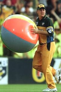
But the addition of... what's the best way to say this?... Overwhelming Grey, was an unprecedented and audacious step. Twenty20 was fast becoming a game for the people, and the fact is people love their boys in green and gold. Not grey, gold and a skerrick of green. Experimentation is fine, but experimentation is like winning the toss and opting to bowl first. If you do this, you better make sure it works. The 2007 World Twenty20 saw a thankful return to the primary gold, with a diluted grey presence, but general consensus among us... er... those ever fashion-conscious yobbos suggested more needed to be done.
 |
Not even the cool-as-ice Damien Martyn could save
this wardrobe malfunction. (c) Getty Images, 2006 |
The 2009-2010 saw Australia return to a more traditional approach to the design. There was a rustier gold combined with dark and fluoro green, faded white stripes and a thankful absence of grey. The early concept of designing a special jersey for cricketers to distinguish all three forms of the game wasn’t gone (as Australia’s ODI cricketers had by then donned all green with glittering gold stripes), but it looked like experimentation was now going to be left to the players, not the designers. And most accepted that.
 |
Michael Clarke and David Warner in a return to form.
(c) AFP, 2010 |
The next, and still current Australian T20I jersey is a mass of contradictions. The Overwhelming Grey concept is back, only now it’s Black, and the coarse gold and green has been dumped in favour of retro brightness, taking on the kind of colours not seen since the days of Alex Kidd in Miracle World. And though the idea of Australia dressing more like the New Zealand team in all black may upset some amber-swilling Aussies (whose beer guts mean they probably can’t fit into the new jersey anyway), the black is actually pretty attractive, particularly on a camera-filled, flood-lit stadium. The Coat of Arms and the Southern Cross shine a little brighter, and the potential discomfort heat-wise in playing in dark colours is irrelevant in games played only at night. Most importantly, it’s not an indecipherable identity like it has been on occasion in the past. Kids and adults, hardcore fans and casual viewers alike, accept this as Australia’s T20 jersey for good. For now.
 |
The agless Brad Hogg in the jersey's latest progression. Black and retro.
(c) Getty Images, 2012 |
No comments:
Post a Comment